Presenting Your Work
As photographers, we all enjoy good, well taken photographs. Photographs that capture our attention, hold our interest and stimulate our visual minds. But how does it work? Is having a well taken image enough to hold the interest of the viewers? Or is there more to it than taking a good photo?
Having dabbled with photography myself for a few years and getting to know some accomplished photographers as well as participating in some exhibitions, I believe taking a good photograph is only half the story. In order to fully appreciate a good photo, one must know how to present it in the proper light.
In this digital age, showing our images over the internet has never been easier. There are various photography forums, photo-sharing sites, customized web galleries and photo-blogs for us to use. Because of the availability of such tools, we can sometime treat these outlets as just a storage rather than a gallery to show our work.
Here are some suggestions that I found useful to show our work as they are meant to be viewed.
Titles
Personally I think titles are one of the hardest point to decide. There are two ways to achieve a title. You can either have an existing title in mind and look for a shot that fits the pre-visualized thought, or you can find a suitable title that fits the shot after it has been taken. Titles are important as it gives a brief introduction of the photo you want to show, and also it gives some direction of the visual flow that you want the viewers to see. In short, it is to guide the viewer on the meaning or purpose of the image.
In the image below, a natural title would be for e.g "Birds in flight", but I've named it "The Chase". Note that the second title dramatically change the story of the image and though it is only two birds flying, the new title nevertheless gave an extra edge to the image.

Of course dramatic titles do not fit every single photo, but the title should be respectable and fits the image. Here are some other examples of titles I've chosen for some of my photos.

"Londonrush"

"All hail the cab!"

"Luxo Brothers™"
Description
Having a description is a good way to explain to the viewer a little more about the photo. Of course one can argue that they prefer to let the viewer interpret the image as they see fit, so I think it depends on the content of the image. A documentary styled composition might do better with a short description to help the viewer understand the image and for some abstract images it may be best to leave it to the viewers themselves.

The Basilica di Santa Maria del Fiore is perhaps the center of attraction in Florence. This Gothic style church has an amazing exterior of white, pink and green marble topped with a magnificent dome which dominate the Florentine skyline. The dome weighs more than 37,000 tones and was built by 4 million over bricks. Reaching the top will reward you with a breathtaking 360 degrees panoramic view of the whole of Florence. That is, if you are not out of breath by the 464 steps up.
But one must have a visually stimulating and interesting image and yet have something that is open to various interpretation for it to go without a description. Either that, or a straight forward composition that does not need a description.

Diptych/triptych/polyptych
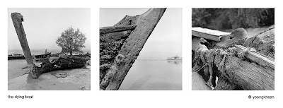
Having two images side by side is called a diptych, three in one panel is a triptych and four or more is a polyptych. This is a good way to present more than one photo which are linked in some way or another to tell a story that an individual photo might not. In order to use this form of presentation, the images must have a good visual flow. Linking one image to the other is not easy in my opinion and this does take some effort.


Photo-essays/series
One of the most rewarding presentation for me is to write a essay accompanied by a series of photos. This will need a common theme for the images and it isn't particularly hard (just choose a theme or describe the photo-outing!) Writing the words that accompany the images will automatically provide a story to the photos. If one wanted to do a series without the words, then it may be a little harder, as with the diptych, it needs a good visual flow for the viewer to understand. This will come with practice and only by going out with a concept in mind before shooting, you can obtain such images.
Prints/frames
Lastly, nothing will beat experience of handling and looking at a print. The tactile sensation will provide a different experience than a digital image on the computer screen. So, choose your best images, print them and frame it properly. I guarantee you that it will show you a different perspective than looking it on a screen.
There they are, I hope this helps some of us here to better present our photos so that the viewers can enjoy it as much as the photographer did.
bY YOONG
No comments:
Post a Comment